
ZENRADIO
Zen Radio is a streaming music platform dedicated to relaxation, mindfulness, meditation, and focus. As part of the Digitally Imported family of music services, the project provided an opportunity to create a cohesive experience across brand, web, and mobile touchpoints. I was responsible for developing the visual identity, designing the web application, and creating the iOS and Android app interfaces. The goal was to craft an experience that felt calm, intuitive, and immersive, allowing the interface to quietly support the music while reinforcing the sense of tranquility at the heart of the brand.
Project Overview
My Role: Branding, UI/UX Design, Graphic Design
Deliverables: Web App, Mobile App, Channel Graphics

"Jude has a clear, modern design sensibility and a disciplined approach to simplicity, translating requirements into interfaces that are both effective and well considered. "
Jo Friedman - C.O.O - ZenRadio (Digitally Imported Inc.)
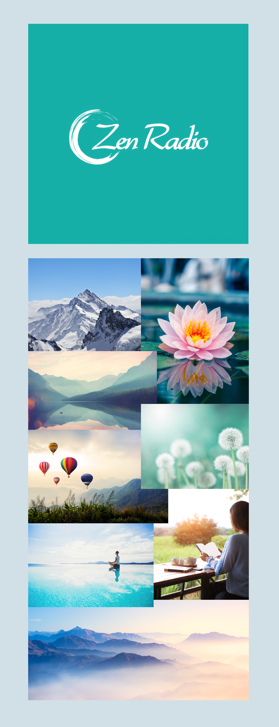
CRAFTING A CALM VISUAL IDENTITY
The visual identity for Zen Radio was inspired by the feeling listeners seek when they press play. A moment of calm, clarity, and escape from the noise of everyday life. Rather than drawing from trends in music streaming or entertainment platforms, the brand was rooted in the principles of mindfulness and the restorative qualities of nature.
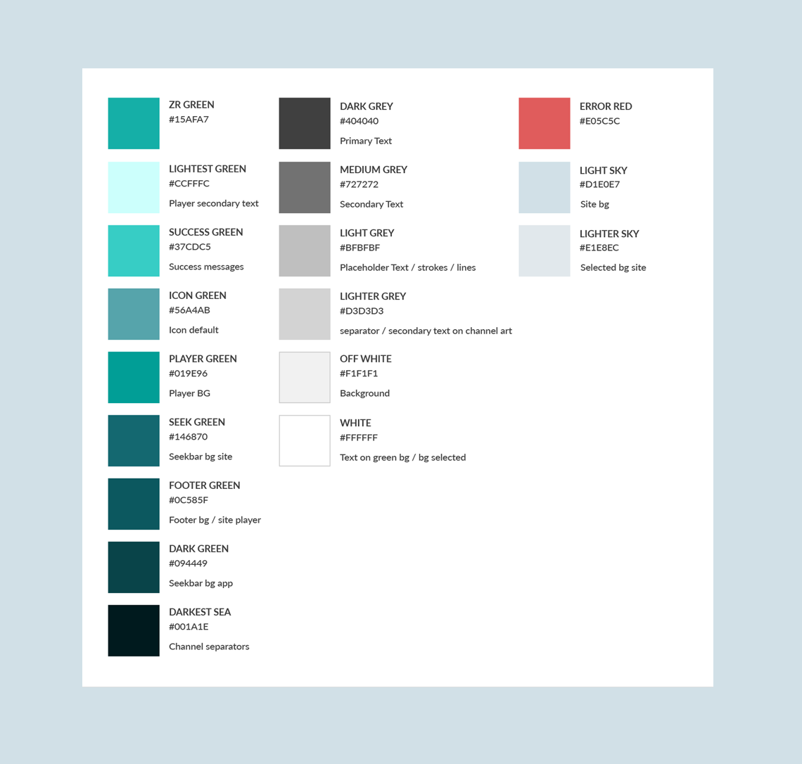
At the heart of the identity is a fresh mint green, chosen for its balance of energy and serenity. It feels modern and digital without becoming cold or clinical, while also evoking growth, renewal, and wellbeing. Supporting shades of aqua, sky blue, and deep teal create a palette that mirrors natural environments from still waters and open skies to forests and mountain landscapes. Together, these colors create a visual rhythm that feels soothing, spacious, and unhurried.
The imagery direction was equally intentional. Instead of focusing on musicians or technology, the brand embraces scenes that evoke reflection, wonder, and tranquility: mist covered mountains, still lakes, blooming flowers, open horizons, and quiet moments of solitude. These images are less about places and more about states of mind. They reinforce the emotional benefits of the platform and help create a deeper connection between the listener and the experience.
The result is a visual language that feels calm without being passive, contemporary without being sterile, and immersive without demanding attention. It allows the music, and the feeling it creates, to remain at the center of the experience.
WEB APP
The Zen Radio web application was designed to make discovering and listening to music as intuitive and frictionless as possible. The experience centers around two primary workflows: helping users browse and discover channels, and providing a focused listening environment once a channel has been selected.
A key objective of the design was to reduce complexity while accommodating a growing library of channels and content. Information architecture, navigation, and content hierarchy were carefully considered to ensure users could quickly find music that matched their interests without feeling overwhelmed by choice.
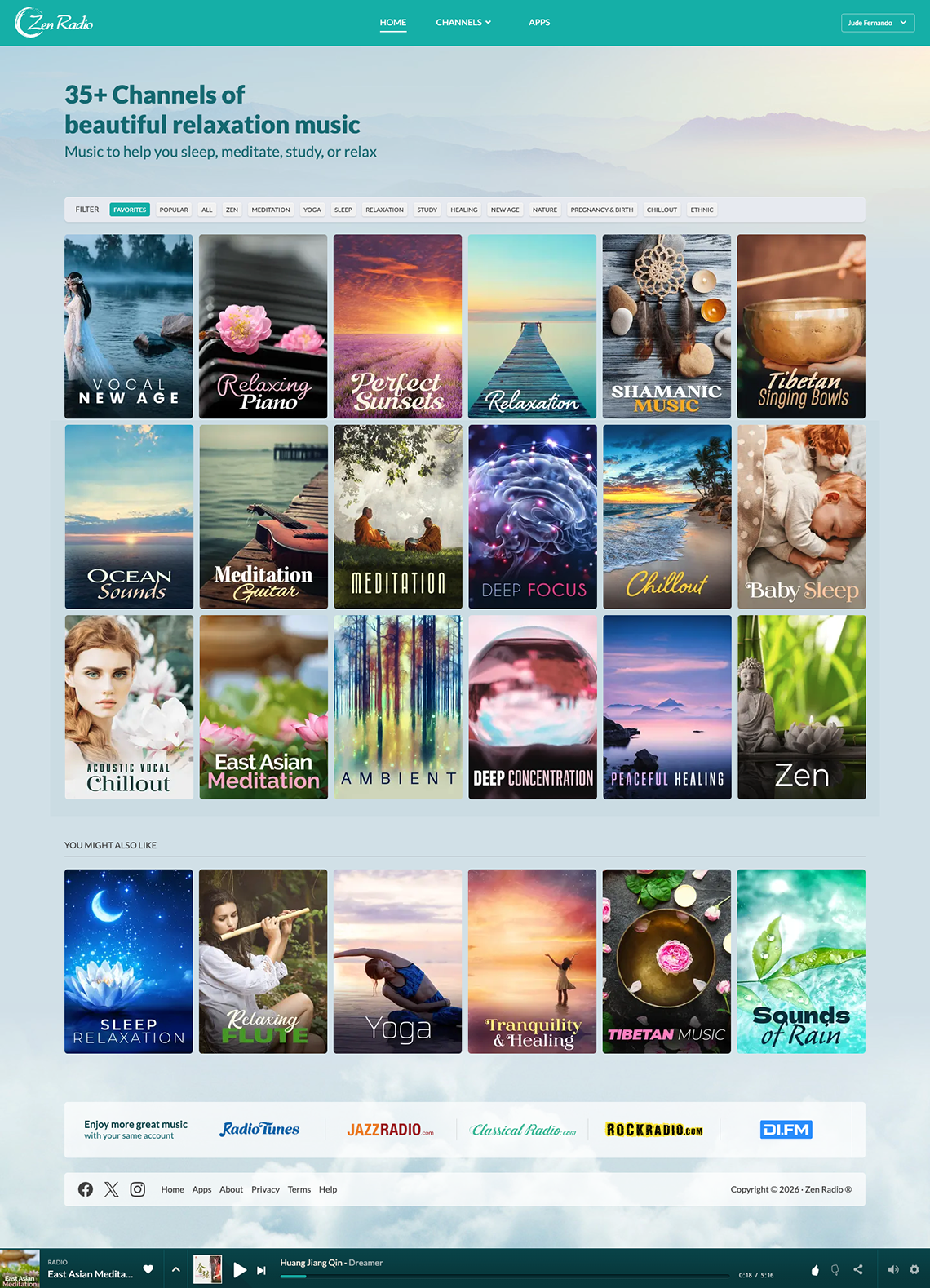
Home
The home screen was designed around the primary user goal of finding the right music with minimal effort. Rather than presenting channels as a traditional list, the experience is centered on large visual channel artwork that allows users to quickly scan, recognize, and select content based on mood, genre, or intent.
A flexible filtering system sits at the top of the interface, enabling users to narrow the channel library by categories such as relaxation, meditation, sleep, focus, and popularity. This approach helps organize a growing content catalog while keeping the browsing experience simple and approachable. By reducing the number of choices presented at any one time, users can more easily discover relevant channels without feeling overwhelmed.
The channel artwork plays an important role in navigation and recognition. Each channel is represented by a distinct visual identity, making it easier for returning listeners to locate favorite channels and build familiarity with the platform over time.
A persistent audio player remains accessible throughout the experience, allowing users to continue listening while exploring additional channels. This minimizes interruptions and supports seamless movement between discovery and playback, ensuring that core listening controls are always within reach without requiring users to leave their current context.
Together, these design decisions create a homepage that prioritizes discoverability, reduces friction, and encourages exploration while maintaining a clear focus on the content itself.
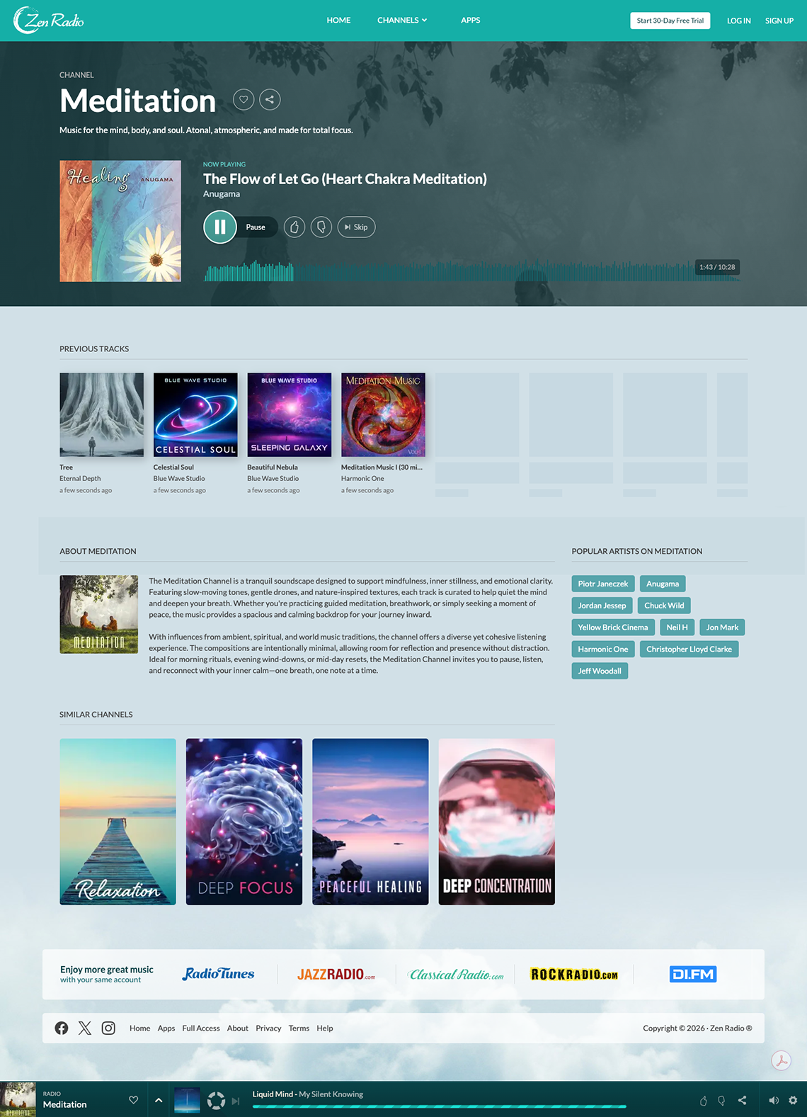
Channel Page
The channel page was designed to support the platform's core listening experience while keeping playback controls and supporting content easily accessible. Once a user selects a channel, the interface shifts from discovery to engagement, placing the music player and currently playing track at the center of the experience.
The player was designed around a clear hierarchy, giving prominence to essential controls such as play, pause, skip, and track information while minimizing visual distractions. Supporting actions, including channel sharing, favorites, and track interactions, are available without competing for attention with the primary listening controls.
Additional content below the player provides context and encourages deeper engagement with the channel. Recently played tracks, a channel description, and related channels help users better understand the content they are listening to and discover new music without leaving the experience.
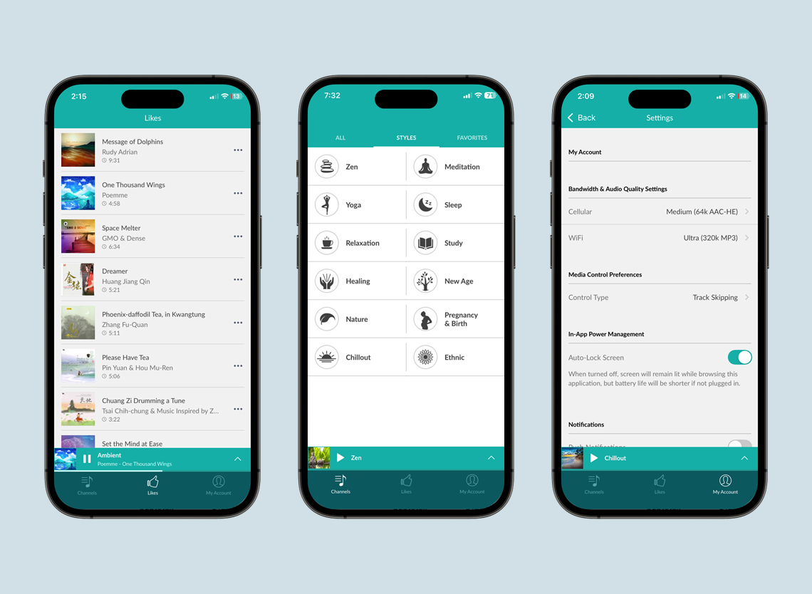
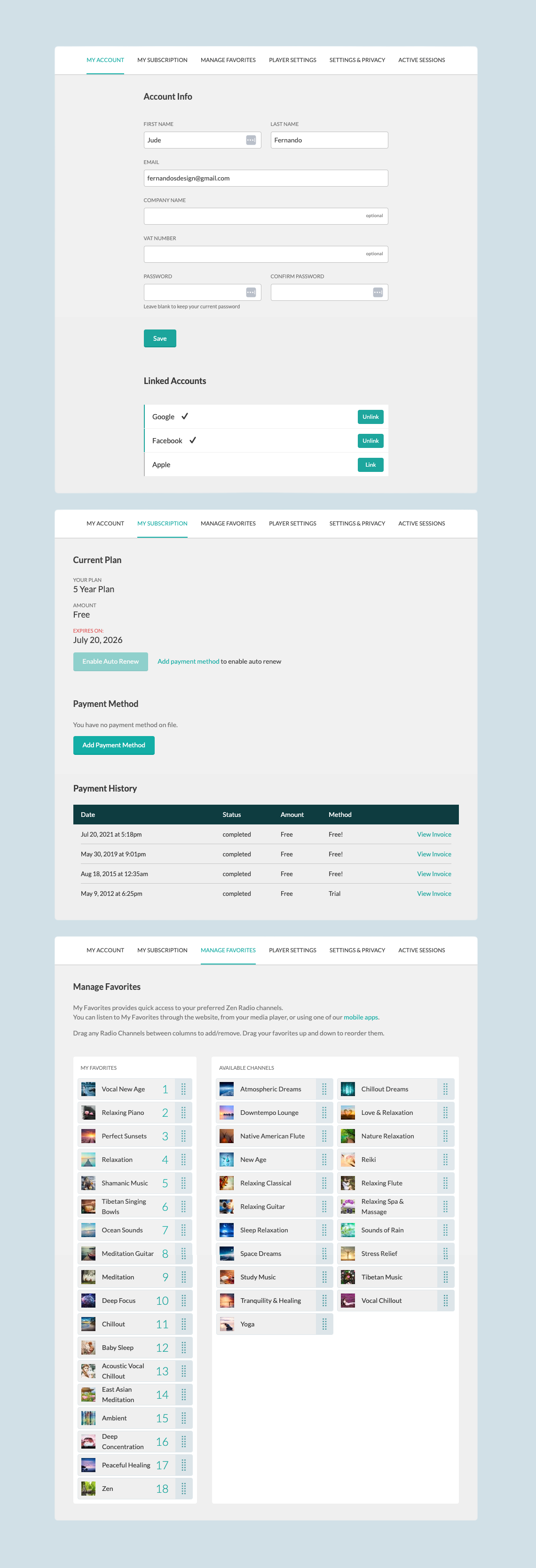
Account and Personalization Dashboard
The dashboard was designed to give users quick access to the tools needed to manage their account, subscription, and listening preferences. A tab based navigation structure organizes functionality into clear sections, making common tasks easy to find and complete.
Subscription and billing screens provide visibility into plan status, payment methods, and transaction history, while the favorites manager allows users to personalize their experience by organizing preferred channels through a simple drag and drop interface.
The overall focus was on clarity, efficient task completion, and maintaining a consistent experience across all account-related workflows.
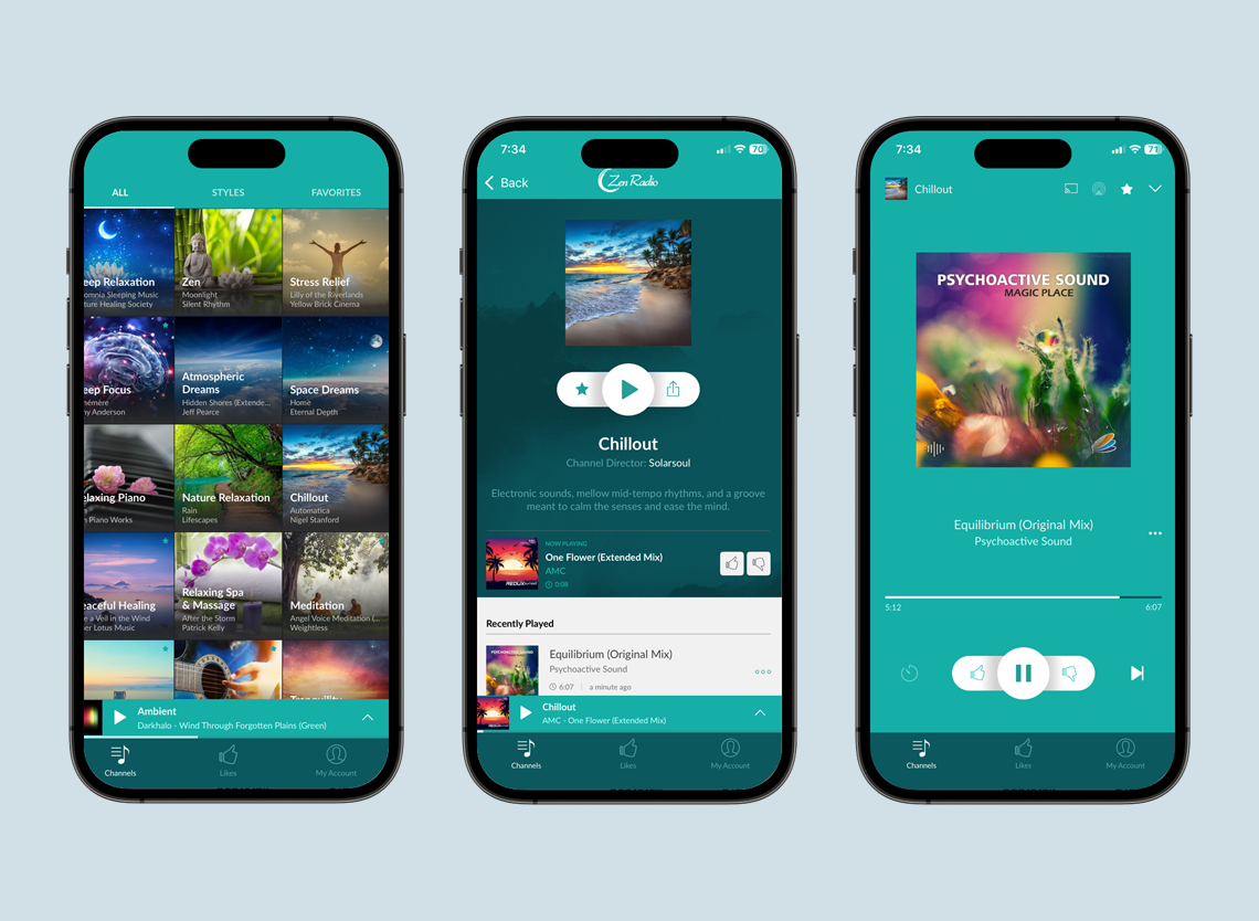
MOBILE APP
The mobile experience centers around two key workflows: browsing and discovering channels, and controlling playback once a channel has been selected.
Particular attention was given to maintaining consistency between the web and mobile experiences while taking advantage of mobile specific patterns such as simplified controls, and optimized layouts for smaller screens. The result is an experience that feels familiar across platforms while remaining tailored to the needs of mobile users.
The following screens showcase key areas of the application. While the examples shown are from the iOS version, equivalent interfaces were designed and implemented for Android to provide a consistent experience across both platforms.