
BACKBONE
As the sole designer on the marketing team, I was responsible for creating a cohesive visual experience across the Backbone brand. My work spanned branding, website design, social media campaigns, and an extensive library of marketing resources including case studies, brochures, presentations, and product collateral. The challenge was to translate a sophisticated enterprise platform into a visual language that felt modern, approachable, and easy to understand while maintaining consistency across every customer touchpoint.
Project Overview
My Role: UI/UX Design, Branding, Marketing Design
Deliverables: Brand Guidelines, Website Interface, Case Studies, Social Media Images, PDF Guides

"Jude is an outstanding designer whose work is consistently high quality, polished, and current. He has strong senior-level experience and stays up to date with trends, tools, and best practices. "
Emi Gonzales - Digital Marketing Manager - Backbone PLM
WEBSITE REDESIGN
The website redesign was driven by the need to better align Backbone's digital presence with the quality and sophistication of its product. The project focused on improving content organization, clarifying the platform's value proposition, and creating a more compelling experience for prospective customers. Visually, the new direction combined authentic photography, vibrant color, and subtle gradients to create a modern, confident brand experience that resonated with the creative professionals who use the platform.
Competitor Analysis
Before beginning the redesign, I conducted a competitive review of leading PLM platforms including Techpacker, WFX, PTC FlexPLM, and Centric Software. The objective was to identify industry best practices, uncover usability issues, and understand how competitors communicated complex products to prospective customers.
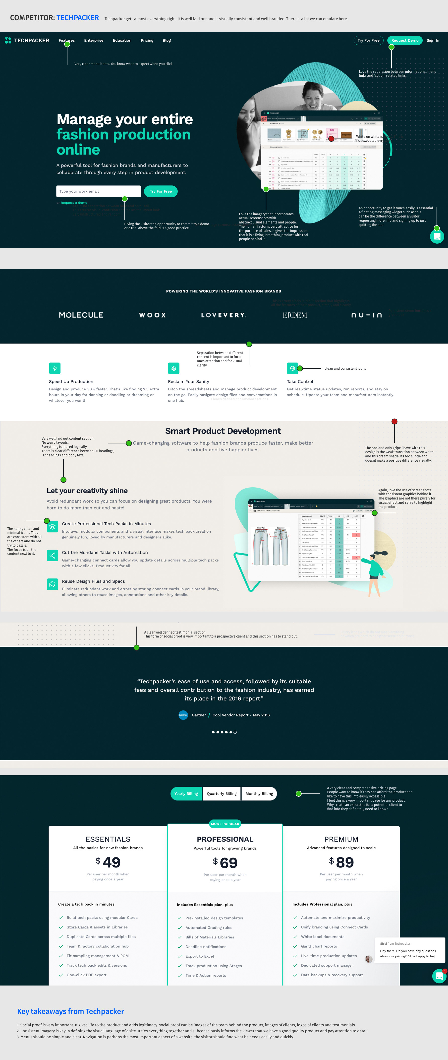
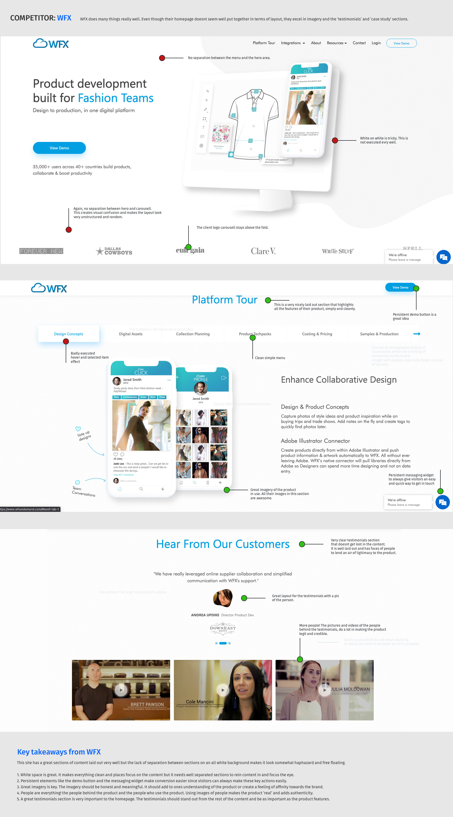
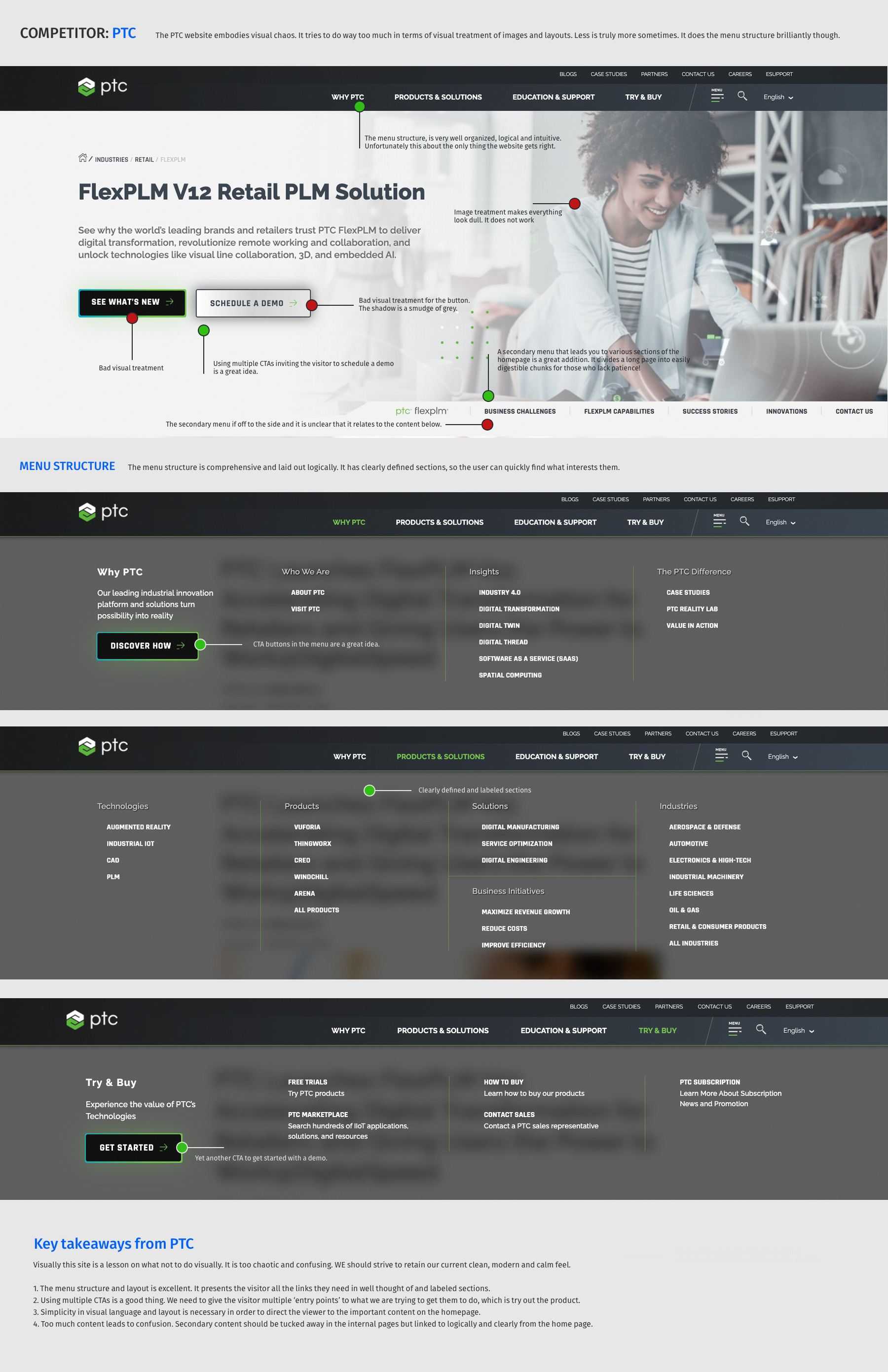
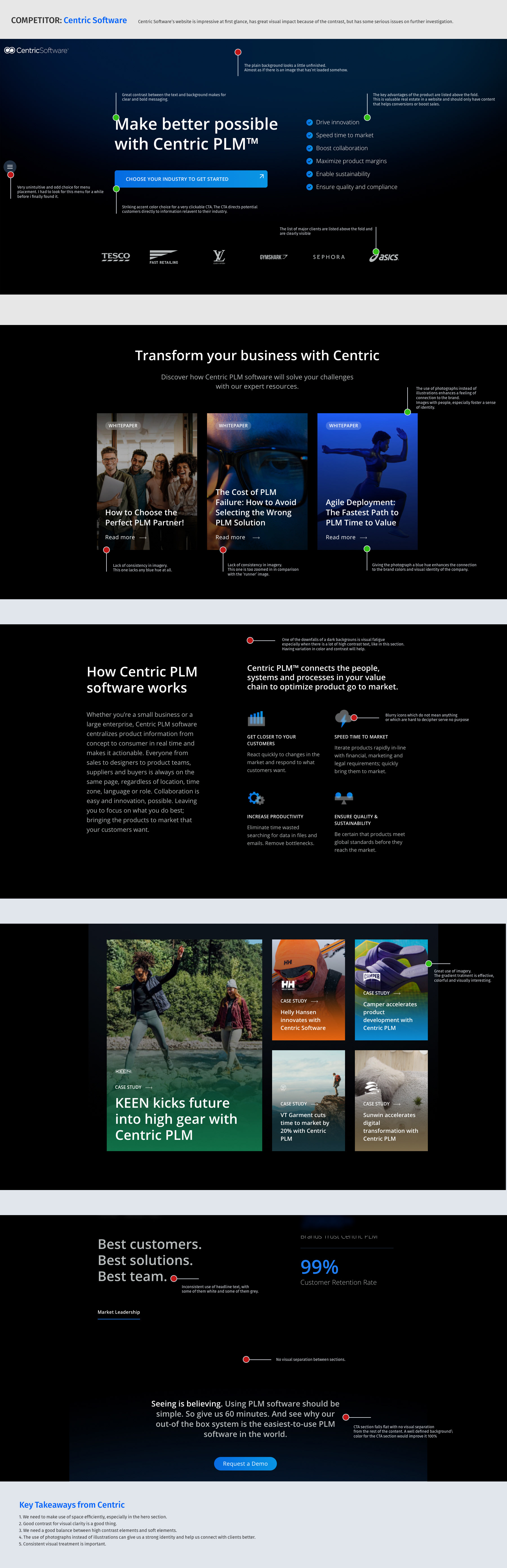
Key Findings
Clear Navigation is Critical
- The strongest competitors used simple, well-organized menu structures.
- Visitors could quickly understand where to find product information.
- Multiple pathways to important content improved discoverability.
Authentic Imagery Builds Trust
- Websites featuring real customers, teams, and product users felt more credible.
- Photography consistently outperformed generic illustrations when communicating trust and product legitimacy.
- Customer-focused imagery helped prospects connect with the product on a more personal level.
Social Proof Drives Credibility
- Successful competitors gave significant visibility to customer logos, testimonials, and case studies.
- Customer stories reinforced product value and reduced perceived risk.
- Testimonials were most effective when accompanied by photos and company branding.
Strong Calls to Action Improve Conversion
- The best performing sites provided multiple opportunities to request a demo or start a trial.
- Clear and consistent CTA placement ensured visitors always had a next step.
- Conversion points were integrated throughout the page rather than limited to the header.
Content Hierarchy Matters
- Large volumes of information were easier to consume when grouped into clearly defined sections.
- Strong visual separation between content blocks improved readability.
- Sites with excessive content or weak hierarchy felt overwhelming and difficult to navigate.
Existing Website Analysis
Before beginning the redesign, I conducted a comprehensive audit of the existing Backbone website to identify usability issues, content gaps, and opportunities for improvement. The goal was to understand what was working well, uncover friction points in the user journey, and establish a clear foundation for the redesign strategy.
The review evaluated key areas including navigation, content hierarchy, messaging, visual communication, social proof, and conversion paths. Each section of the website was analyzed from both a user experience and marketing perspective, focusing on how effectively the site communicated Backbone's value proposition and guided visitors toward meaningful actions.
Areas of Strength
Several elements of the existing website provided a strong foundation for future improvements:
- A clean, modern visual design with a distinctive blue-led brand identity.
- Clear typography and strong readability throughout the site.
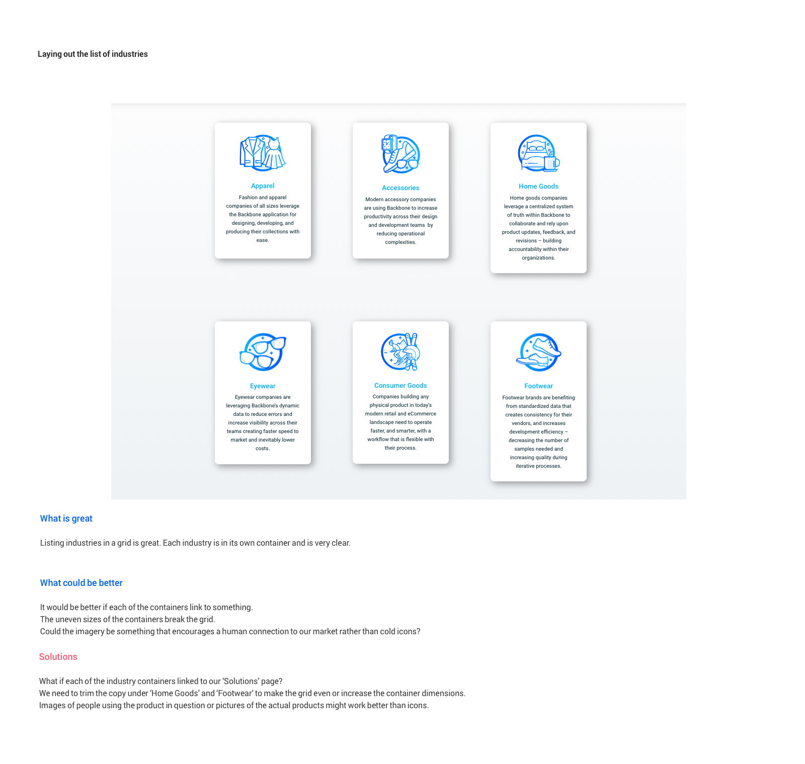
- Well-structured content blocks that communicated product benefits effectively.
- A logical industry segmentation system that helped visitors identify relevant use cases.
- Consistent use of calls-to-action throughout the user journey.
- Good use of whitespace and generous spacing that prevented content from feeling overwhelming.
Key Opportunities
While the visual design was modern and professional, several areas limited the website's effectiveness.
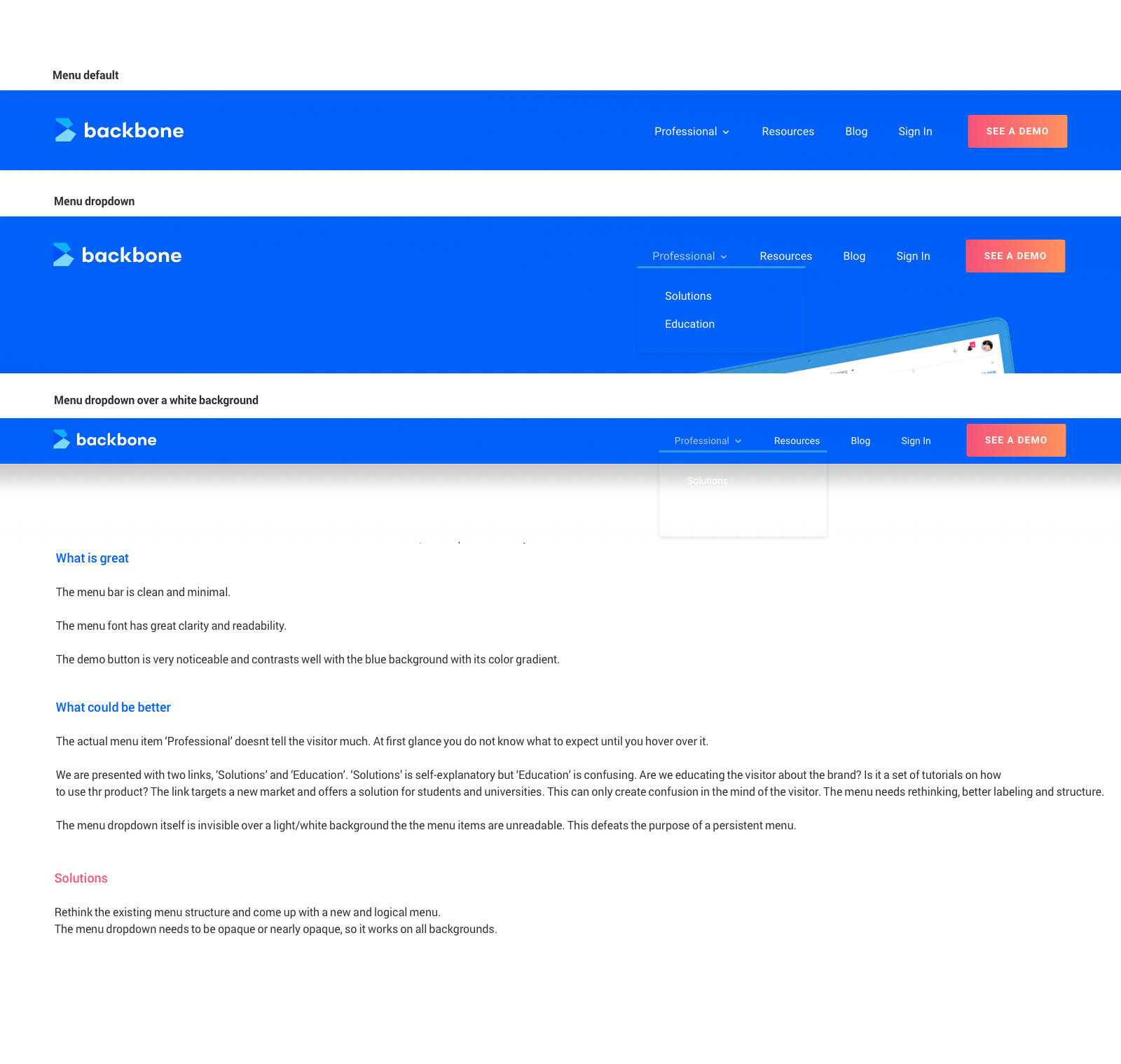
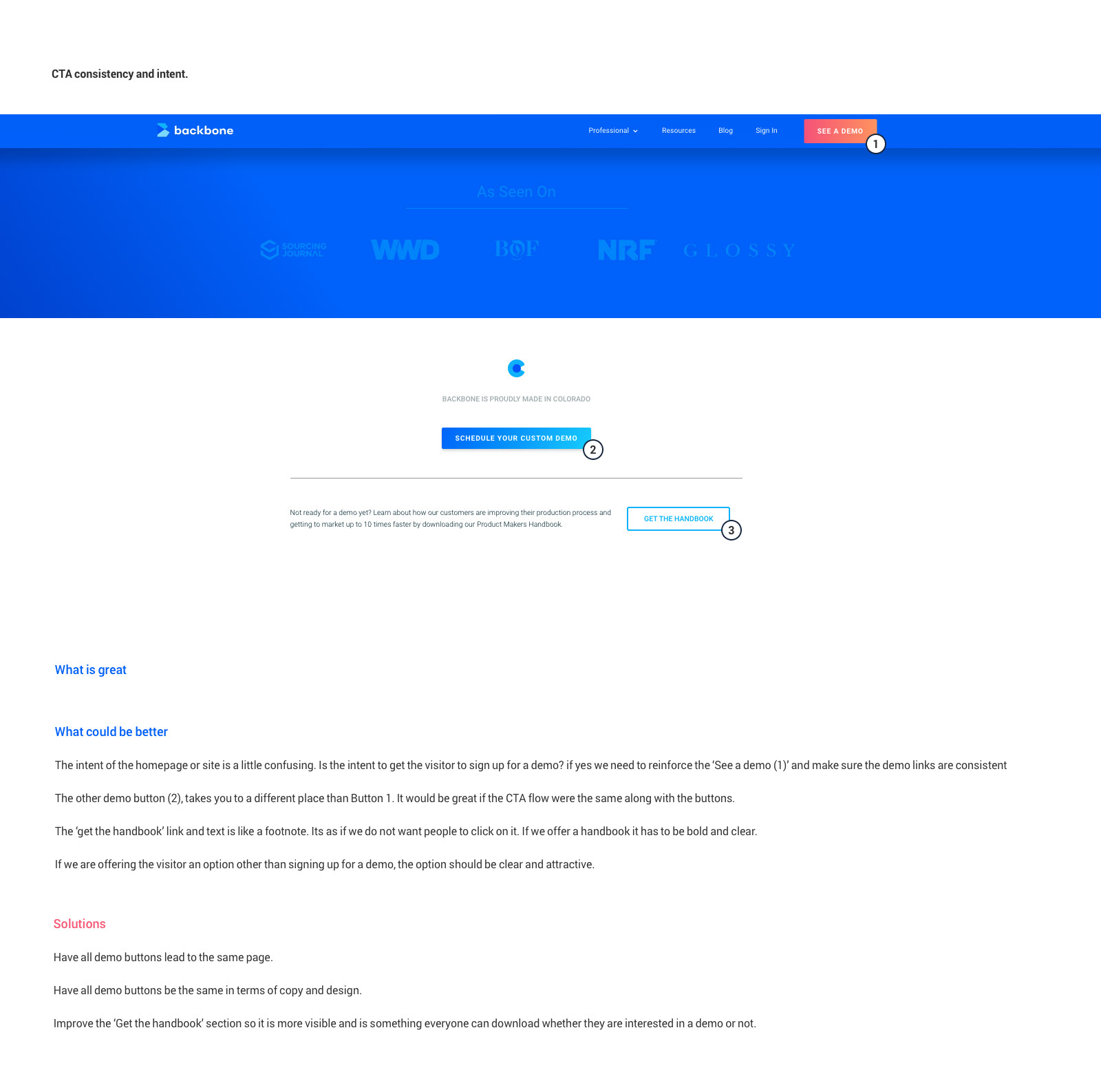
Navigation & Information Architecture
- Menu labels such as Professional and Education lacked clarity and required interpretation.
- Navigation structure did not always reflect the mental model of prospective customers.
- Dropdown menus lacked sufficient contrast and visibility against certain backgrounds.
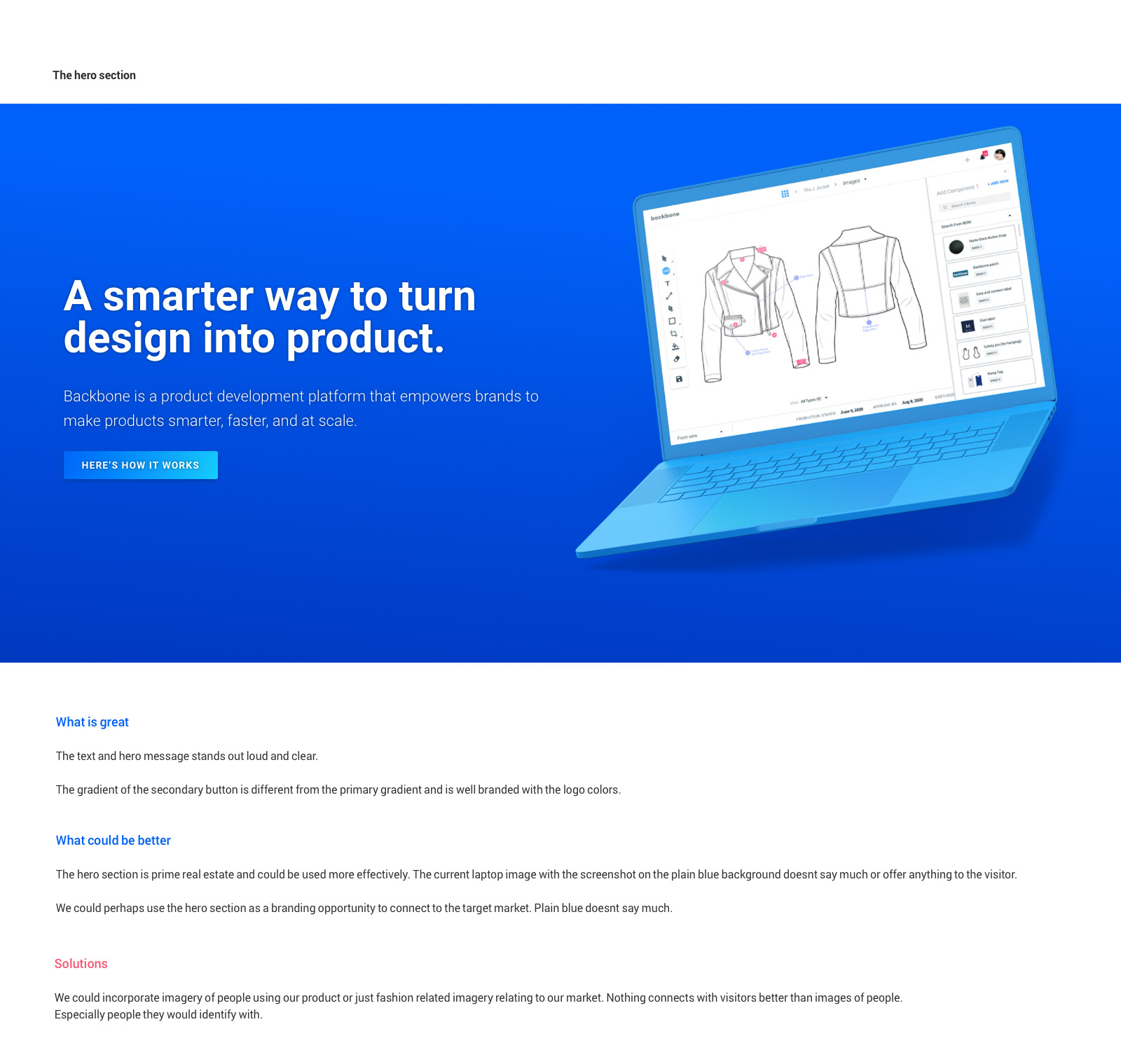
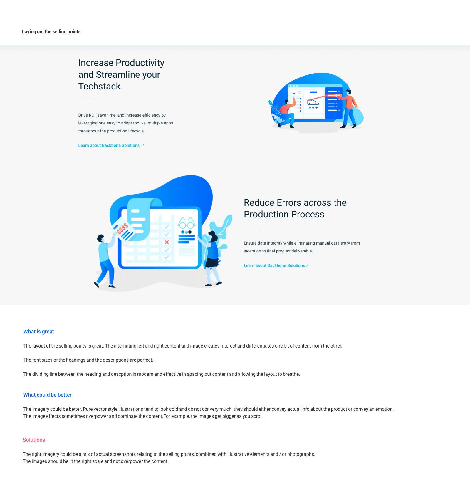
Hero Experience
- The hero section communicated the product clearly but did little to establish an emotional connection with visitors.
- Product screenshots alone did not fully communicate the value of the platform or the industries it served.
- The most prominent area of the page presented an opportunity to better reinforce the brand and target audience.
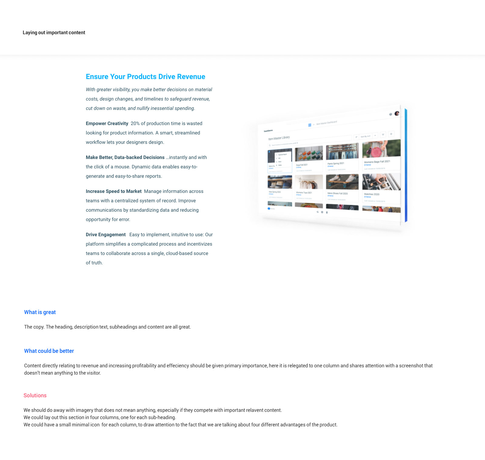
Content Hierarchy
- Important business outcomes such as revenue growth, efficiency gains, and collaboration improvements were sometimes visually competing with supporting imagery.
- Several sections relied heavily on product screenshots or illustrations without sufficiently reinforcing the accompanying messaging.
- Some content layouts prioritized aesthetics over communication.
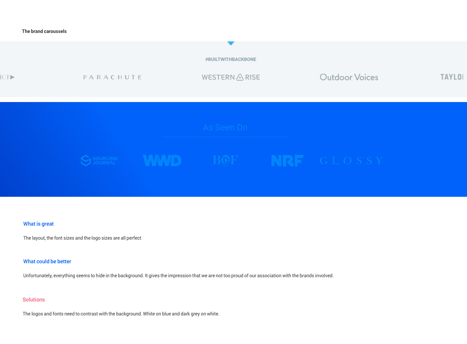
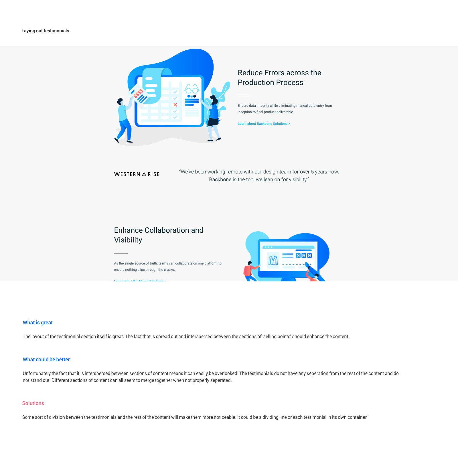
Social Proof
- Customer logos and media mentions lacked visual prominence and were easy to overlook.
- Testimonials were integrated into surrounding content but did not stand out as trust-building moments.
- Opportunities existed to better leverage customer success stories and industry credibility.
Conversion Strategy
- Multiple calls-to-action existed throughout the site but were not always consistent in language, styling, or destination.
- Demo requests and secondary resources followed different user paths, creating unnecessary friction.
- Some valuable resources appeared visually understated despite their potential marketing value.
Key Insights
The analysis revealed that the website's primary challenge was not visual quality but communication effectiveness. The site already possessed a strong design foundation, however important messages, customer proof points, and conversion opportunities were often competing for attention rather than working together as part of a cohesive narrative.
These findings directly informed the redesign strategy, leading to a greater emphasis on clear navigation, stronger content hierarchy, more visible social proof, consistent conversion pathways, and imagery that better connected with Backbone's target audience. The result was a website that not only looked modern but communicated the platform's value more clearly and effectively.
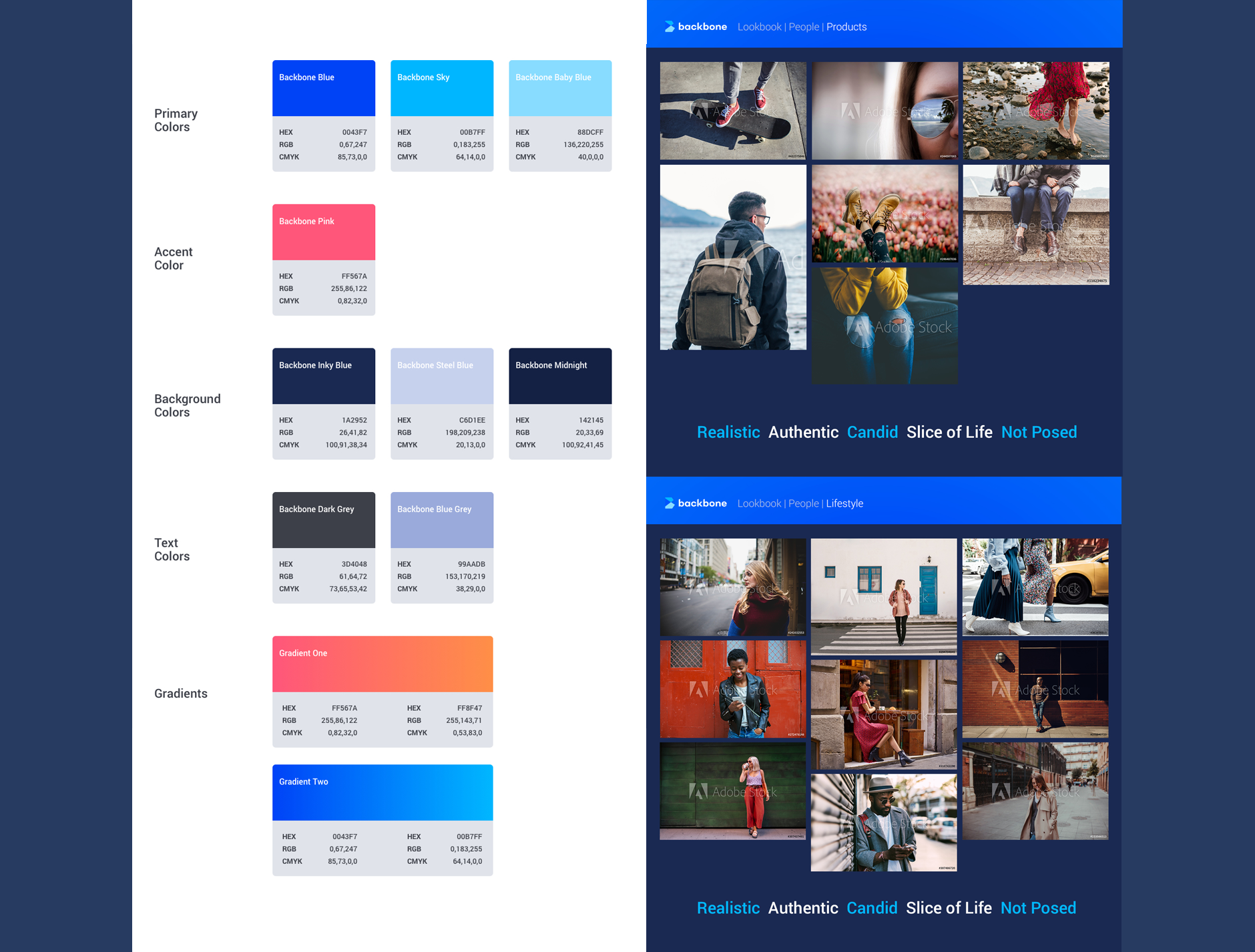
COLOR AND IMAGE CHOICES
The color palette is built around a vibrant electric blue, chosen to represent innovation, technology, and confidence. Rather than relying on the muted tones commonly found in enterprise software, the brighter blues inject energy into the experience and help position Backbone as a modern, forward-thinking brand. Deep navy backgrounds provide contrast and stability, creating a foundation that allows both content and imagery to stand out. A coral to orange accent gradient introduces warmth and personality, adding moments of visual excitement while drawing attention to important calls-to-action throughout the experience.
The imagery strategy was designed to move beyond generic software marketing. Instead of focusing solely on product screenshots or abstract illustrations, the visual language embraces authentic, candid photography that reflects the people behind the products. The selected imagery captures moments of creativity, exploration, and everyday life. This approach reinforces Backbone's role as a platform built for creative teams, creating an emotional connection with visitors while making the brand feel more human, relatable, and memorable.
Together, the palette and imagery create a brand that feels both professional and inspiring.
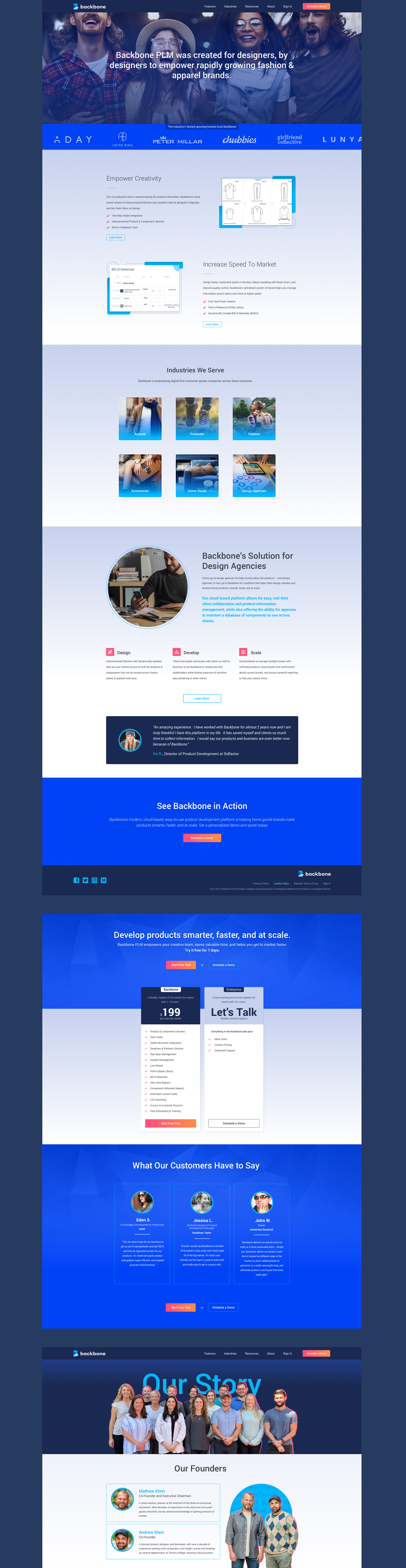
INTERFACE HIGHLIGHTS
Although Backbone has since been acquired and the original website is no longer publicly accessible, the following screens highlight key areas of the interface and the design principles that informed the final experience.
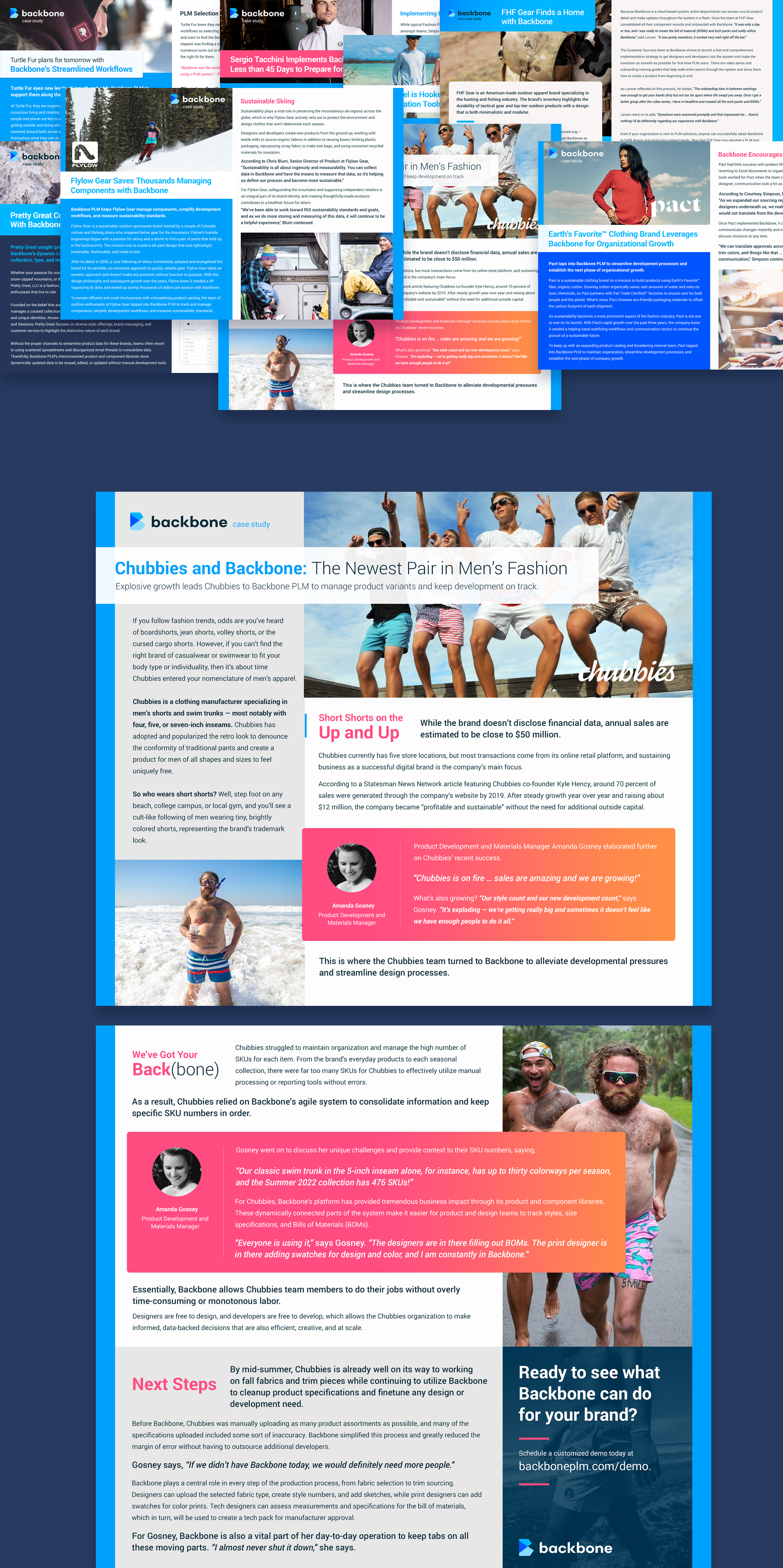
CASE STUDIES
Rather than relying on a conventional corporate presentation, I used bold color blocking, oversized photography, and asymmetrical layouts to create visual energy and reflect the personalities of the featured brands.
The design intentionally balanced storytelling with credibility. Strong typography and unconventional compositions helped break up long-form content, while customer quotes, statistics, and product outcomes were integrated into the layouts to reinforce key business results. The result was a series of case studies that felt engaging and distinctive while still communicating measurable value to prospective customers.
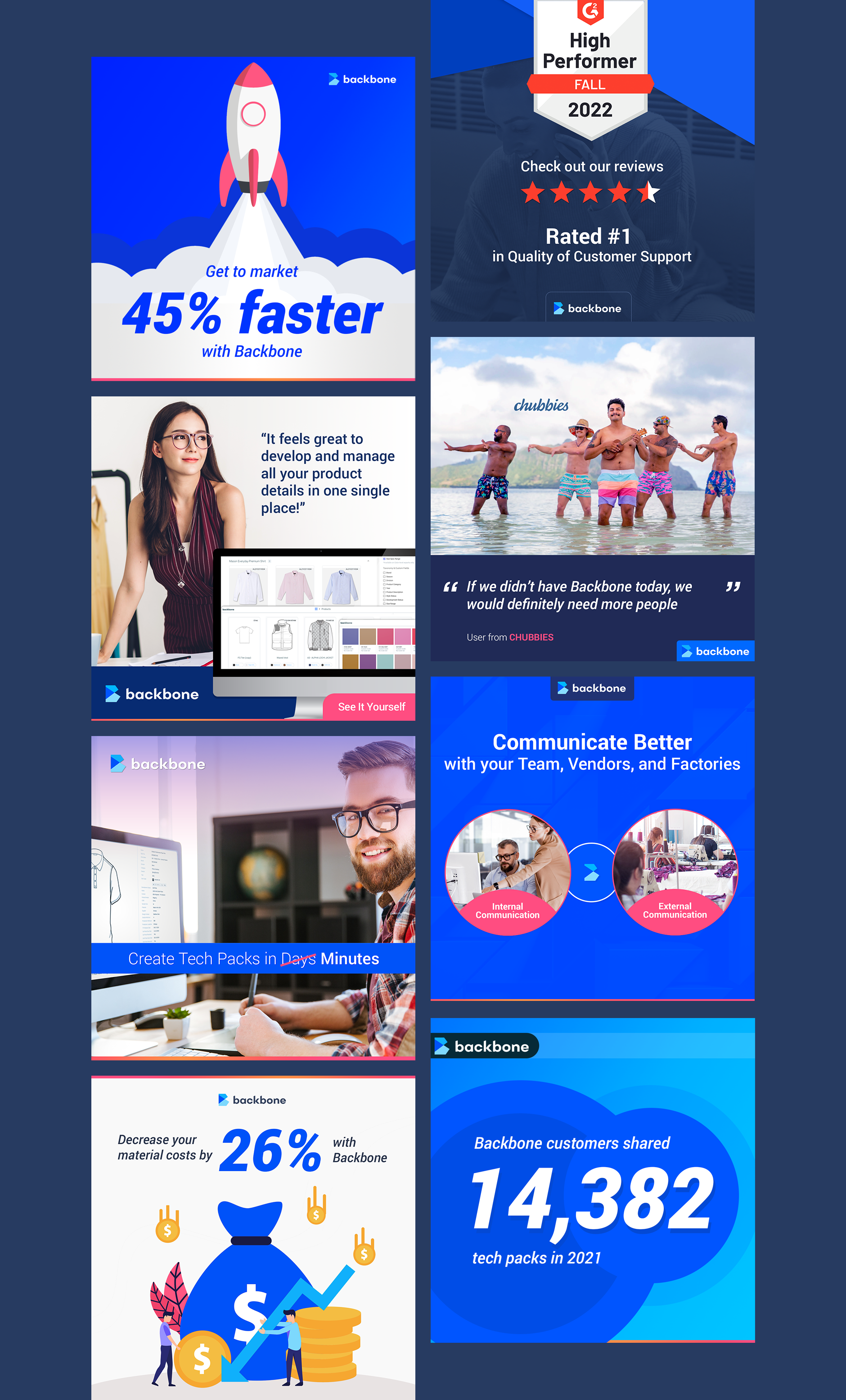
SOCIAL IMAGERY
The designs combined the brand’s bold blue palette, strong typography, and product-focused messaging to create content that remained recognizable across channels while supporting a variety of marketing objectives. They communicate product benefits, customer success stories, and key business metrics in a more concise and visual format.
A key consideration throughout the work was creating scroll-stopping visuals that could capture attention in crowded social feeds. Large headlines, strong contrast, bold statistics, and confident use of color were used to communicate a single message quickly and effectively. Whether highlighting measurable outcomes, promoting customer testimonials, showcasing industry recognition, or reinforcing core product capabilities, each asset was designed to deliver value within seconds while maintaining a consistent brand presence.
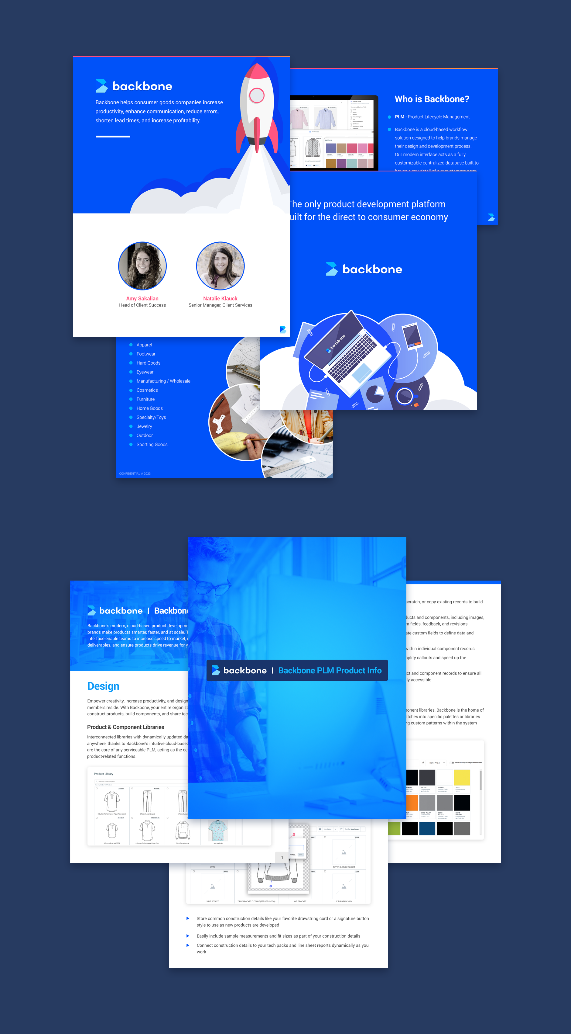
PDF GUIDES AND SALES COLLATERAL
As part of Backbone’s marketing ecosystem, I designed a range of downloadable PDF guides, sales presentations, and product overview documents used throughout the customer journey. These materials helped communicate complex product capabilities in a structured and accessible format, supporting both lead generation and sales conversations.
The design approach extended the visual language established on the website, using bold brand colors, clear information hierarchy, and product-focused imagery to create a cohesive experience across digital and offline touchpoints.